
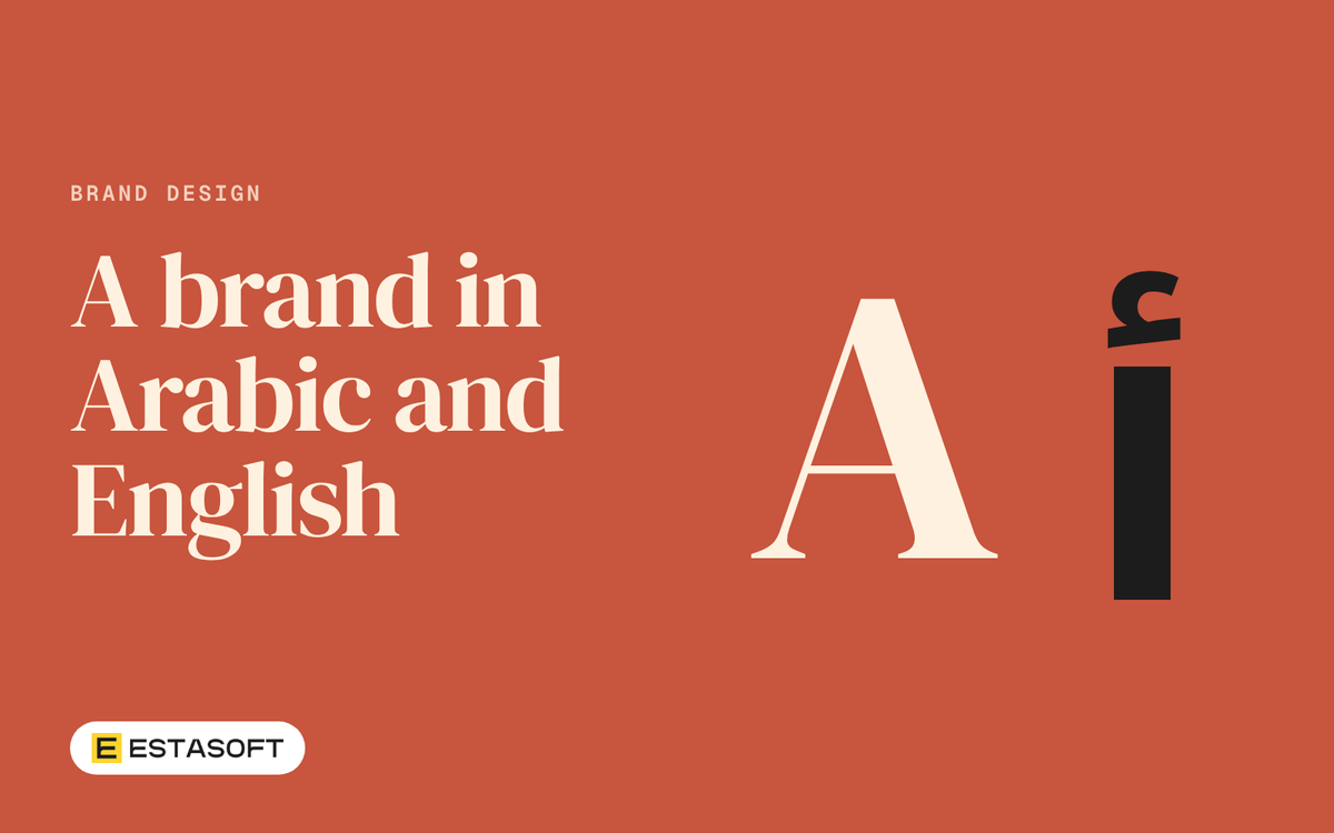
A bilingual business often ends up with two logos that do not look related. The English version was drawn first, the Arabic name was added later, and the two sit side by side at different sizes and weights. Then the sign, the invoice and the phone screen each treat them in their own way.
This guide is for owners who need one identity that works in Arabic and in English. It follows a designer's order: name, logo set, type, digits, colour, licences and files, then a brand sheet checklist. Our guides to planning Arabic and English on one store and to Arabic on a store or website cover the plan, page layout and search boxes. This one is about the identity itself. We read every source on 4 November 2026.
Decide what the Arabic name is
Settle the words before any drawing. The Arabic name can be your English name spelled out by sound, a translation of its meaning, or a separate name. A sound-spelling keeps one name people can say in both languages. A translation tells a one-script reader what you do. A separate name means building two brands. Choose on purpose.
Then test the spelling. Say the name aloud to two or three native Arabic readers, one at a time, and ask each to write it down. If the spellings differ, settle one before it appears on a sign. Give a slogan the same test, because a word-for-word translation may not read naturally.
Plan a logo set, not one logo
A shop front, a box, a van, a phone icon and an email footer need different shapes. Ask your brand design team for a set, with a rule for when each piece is used:
- Horizontal and stacked lockups: both names on one line, or one above the other.
- Single-script versions: Arabic only and English only, for tight spaces or places that require one language.
- Symbol alone: a mark that works with no letters, for app icons, stamps and profile pictures.
- Colour variants: full colour, one colour, and light on dark.
Decide which script leads in each lockup, write the reason down, and test every piece at its smallest real size, such as a phone icon or a delivery label.
Do not use a mirror tool to make the "Arabic version" of a logo. Apple's right-to-left guidance for app design says not to flip logos and to show a logo in its original form, even if it contains text. If you want the scripts in the opposite order, ask for a separate, approved file.
Arabic letters also join. W3C's Arabic layout note (a Group Draft Note dated 2 October 2025) says users may want to style one letter or a few, and shows a logo with a colour change across joined letters as an example, but that such styling should not break the joins with neighbouring letters. It adds that moving joined letters closer together or further apart gives poor results. So do not add wide letter spacing to an Arabic wordmark, and check any colour split inside an Arabic word in every file you receive.
Pair type by proportion, not by point size
The same point size does not make two scripts look equal. A page on the Khatt Foundation site by Edo Smitshuijzen says one coherent style across Arabic and Latin needs matching stem thickness, letter details and proportions. It puts the readable zone between the Latin x-height and the Arabic loop-height. W3C's note says Arabic ascenders and descenders reach much further than Latin ones, lists the size issue in mixed text as a consideration and gives no ratio. There is no standard ratio to copy.
So match by eye. Set your name in both scripts, adjust until the stroke thickness and main body of the letters look equal, and record both sizes in the brand sheet. Do the same for each weight pair, such as regular with regular and bold with bold.
Families relate the two scripts in different ways. Google Fonts describes Alexandria as the Arabic companion of Montserrat, a Latin typeface. Its Cairo page says Mohamed Gaber extended the Latin family Titillium Web to support Arabic. Its Tajawal page describes one family with a low contrast Arabic and a sans serif Latin. These are examples of what to look for, not recommendations: who drew the Arabic, and was it drawn to sit with a particular Latin design?
Style matters too. W3C calls Naskh the default form of Arabic in most contexts and the basis of most typefaces made for continuous reading, and says Thuluth is used mainly for large decorative work. A wordmark can use a more expressive hand than text people read at length. Ask which style the Arabic wordmark draws on and why. List line heights for both scripts in the brand sheet, because spacing set for English may clip Arabic marks.
Digits: set a rule for every place a number appears
Arabic text can use more than one digit style. Apple's page says it might use either Western or Eastern Arabic numerals, and that usage varies by country, region and area. W3C's note names European digits 0 to 9, Arabic-Indic digits, and Eastern Arabic-Indic digits, the last used in Iran and Afghanistan. We found no official source for what shoppers in each Gulf country expect, so ask your own customers and printer. Then fix a rule for each use: prices, phone numbers, order and tracking numbers, dates, and ads.
Apple's guidance also says to keep the digit order inside a specific number such as a phone number, and never to flip the numerals themselves. Test your fonts first: set a price, a phone number and a date in each style and look for shapes that clash with the letters around them.
Colour and contrast for both scripts
W3C's Understanding page for WCAG 2.2 contrast (updated 6 September 2026) sets 4.5 to 1 as the level AA minimum contrast for normal text and 3 to 1 for large text, meaning at least 18 point, or 14 point bold. It says ratios are not rounded, so 4.499 to 1 fails. Text that is part of a logo or brand name has no contrast requirement, but other brand text is not exempt, so body text and button labels still have to pass. A second W3C page sets 3 to 1 for interface components and the parts of graphics needed to understand content, and exempts logos the same way.
Record approved text and background pairs in the brand sheet with their ratios, and test small Arabic text, with its dots and marks, on a phone at low brightness. A ratio is a minimum, not a promise of comfort. Also ask which way any arrow, swoosh or gradient points in each lockup, and ask readers in each market whether a colour or symbol carries a meaning you did not intend.
Fonts and licences
Check the licence of every font before it goes into a logo. The README of the google/fonts repository on GitHub says most fonts there use the SIL Open Font License 1.1, some use Apache 2, the Ubuntu fonts use their own licence, and each family's folder holds its licence file. The OFL FAQ says OFL fonts can be used in logos with no extra permission, and cannot be sold on their own.
Commercial services have their own terms. Adobe's font licensing FAQ (last updated 27 March 2026) says fonts added through Adobe Fonts are licensed for personal and commercial use, that you can copyright or trademark a logo you create but not the typeface designs in it, and that clients who edit live text need their own licence. Other foundries differ. For every font, ask who holds the licence, whether it covers print, web, apps and signs, and what happens when the designer leaves.
Trademark: questions for the office
A name you like may be taken, and a logo you own may be unprotected. Neither is a design question. For the UAE, the government portal page (updated 27 October 2026) names the Ministry of Economy and Tourism as the authority, says applications are made online, and cites Federal Decree Law No. 36 of 2021 on Trademarks. It lists names, text, characters, symbols, drawings, shapes and colour combinations among possible marks. The Ministry's own page says it compares an application with registered and pending marks.
The Saudi Authority for Intellectual Property page we read says the Authority can accept an application, refuse it, or accept it on condition of changes, and that agent-filed requests need an agent in its Agent Registry. It does not state a filing language. We did not read the pages for other Gulf countries. Ask an adviser or the office:
- Do we file the Arabic name, the English name, the combined logo, or more than one?
- Is a name in Arabic and Latin letters one mark or two?
- If we change the lockup later, what must be filed again?
- Do we need a local agent?
Files and formats
Ask for files, not pictures. MDN's image guide (last modified 8 October 2026) says to prioritise SVG for icons whenever possible, that SVG scales smoothly, and that logos suit lossless formats. It says PNG supports full transparency and JPEG does not. Your list should hold a vector master of every lockup, an SVG for the website, a transparent PNG per colour variant, a favicon, and the editable sources. Ask for lettering as drawn shapes so the logo does not depend on an installed font.
Brand sheet checklist
Put these in one document that a printer, sign maker or web developer can follow without calling you.
- Name: English and Arabic spellings, slogan in both, and who approved them.
- Logo set: each lockup with a "use when" line and a smallest size.
- Do not list: no mirroring, stretching, wide Arabic letter spacing or broken joins.
- Fonts: families, weights, sources and licence holder.
- Matched sizes and line heights: one pair per use, for both scripts.
- Digits: the rule for each use.
- Colour: exact values, approved pairs and contrast ratios.
- Direction: what flips on a right-to-left page and what stays.
- Files: where masters, web files and sources are kept.
- Trademark: what was filed, where, when, and the adviser's name.
- Proofs: a printed proof in both scripts before a large order.
This is general information, not legal or tax advice. Check the current rules or ask a qualified adviser before you decide.
ESTASOFT has offices in Dubai, Erbil and London and offers brand design. To turn this list into one working identity, send a short brief on the contact page. When it is ready, our guide to testing a bilingual website shows how to check it on screen.
Sources
- Arabic and Persian Layout Requirements (W3C): joins and styling, letter spacing, ascenders and descenders, calligraphic styles, digit families (checked 4 November 2026)
- Multiple Baselines (Khatt Foundation): matching stems, proportions and x-height with loop-height across scripts (checked 4 November 2026)
- Right to left (Apple Human Interface Guidelines): do not flip logos, numerals and digit order (checked 4 November 2026)
- Alexandria (Google Fonts): Arabic companion of Montserrat (checked 4 November 2026)
- Cairo (Google Fonts): Arabic extension of a Latin family (checked 4 November 2026)
- Titillium Web (Google Fonts): spelling of the family name (checked 4 November 2026)
- Tajawal (Google Fonts): one family with Arabic and Latin (checked 4 November 2026)
- Understanding SC 1.4.3 Contrast (Minimum) (W3C): ratios, large text, logotype exemption (checked 4 November 2026)
- Understanding SC 1.4.11 Non-text Contrast (W3C): 3 to 1 for components and graphics, logo exemption (checked 4 November 2026)
- google/fonts (GitHub): licences used and where licence files sit (checked 4 November 2026)
- OFL-FAQ (SIL): logos, selling fonts, reserved names (checked 4 November 2026)
- Frequently asked questions about font licensing (Adobe): commercial use, logos, client licences (checked 4 November 2026)
- Intellectual property (UAE government portal): authority, governing law, what can be a mark (checked 4 November 2026)
- Register Trademark (UAE Ministry of Economy): examination against registered and pending marks (checked 4 November 2026)
- Trademark Registration (Saudi Authority for Intellectual Property): review outcomes and agent requirement (checked 4 November 2026)
- Image file type and format guide (MDN): SVG, PNG, lossless formats, favicon (checked 4 November 2026)